The Impact of Mobile-First Design on Web Development
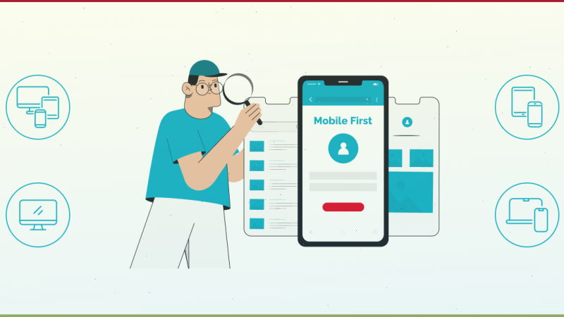
In the ever-evolving landscape of web development, particularly in e-commerce, Shopify developers are embracing a game-changing trend: mobile-first design. As the name suggests, mobile-first design prioritizes the mobile user experience over the desktop. This approach has become increasingly important as mobile internet usage continues to surpass desktop usage globally. Let’s explore the significance of mobile-first design and its impact on web development.
Why Mobile-First Design?
The shift towards mobile-first design is driven by the rapid growth of mobile device usage. According to recent statistics, over 50% of global web traffic comes from mobile devices. This trend is expected to continue, making it essential for web developers to prioritize mobile users. Mobile-first design ensures that websites are optimized for smaller screens, touch interfaces, and varying network conditions.
Key Principles of Mobile-First Design
- Responsive Design: Mobile-first design emphasizes creating responsive websites that adapt to different screen sizes and orientations. This ensures a seamless user experience across all devices.
- Performance Optimization: Mobile users often face slower internet speeds compared to desktop users. Mobile-first design focuses on optimizing website performance to reduce load times and improve user experience.
- Simplified Navigation: Mobile-first design advocates for simple and intuitive navigation. This includes using larger buttons, concise menus, and easy-to-access content.
- Content Prioritization: With limited screen space, it’s crucial to prioritize content. Mobile-first design encourages developers to display the most important information prominently and minimize distractions.
Benefits of Mobile-First Design
- Improved User Experience: By prioritizing mobile users, websites become more accessible and user-friendly. This leads to higher engagement and lower bounce rates.
- Better SEO: Search engines like Google prioritize mobile-friendly websites in their rankings. Implementing mobile-first design can improve your website’s visibility and search engine performance.
- Increased Reach: A mobile-first approach ensures that your website is accessible to a broader audience, including those who primarily use mobile devices.
- Future-Proofing: As mobile technology continues to evolve, a mobile-first design ensures that your website remains relevant and functional on new devices and platforms.
Implementing Mobile-First Design
To successfully implement mobile-first design, web developers should start by designing for the smallest screen size and progressively enhance the design for larger screens. This approach, known as progressive enhancement, ensures that the core functionality and content are accessible on all devices.
Additionally, developers should leverage tools and frameworks that support responsive design, such as Bootstrap and Foundation. These frameworks provide pre-built components and grid systems that simplify the process of creating responsive websites. Collaborating with skilled Shopify developers can further enhance e-commerce platforms’ mobile shopping experience.
Conclusion
The impact of mobile-first design on web development cannot be overstated. As mobile usage continues to rise, adopting a mobile-first approach is essential for creating user-friendly, accessible, and high-performing websites. By prioritizing mobile users, web developers can enhance user experience, improve SEO, and reach a wider audience. For e-commerce businesses, collaborating with skilled Shopify developers can further enhance the mobile shopping experience, driving growth and success in the digital marketplace. Embrace the mobile-first revolution and ensure your website is ready to meet the demands of today’s mobile-centric world.